
Checks For Less (CFL) is a family-owned Maine business that has grown into one of the country’s largest printers of custom business checks. Like a lot of businesses around the world, they felt a sharp hit to their sales as the coronavirus pandemic emerged in early 2020. Although CFL’s digital advertising programs were still bringing a steady stream of traffic to the site, less and less of that traffic was turning into sales, as potential customers were holding off on purchases. A similar number of users were entering the checkout flow as before the pandemic, but fewer of them were checking out via CFL’s ecommerce platform.
The CFL team approached VONT for help in figuring out what they could do to get more of their site’s users to become customers.
Note: While VONT handles CFL’s digital marketing, the Checks For Less team designs and maintains their own website.
Where were users abandoning the site?
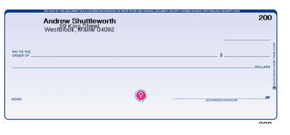
Due to the highly custom nature of the product, the CFL purchase path is more complicated than most ecommerce websites. The most popular product, for example, requires the user to go through a minimum of 12 steps from product detail page to final confirmation screen.
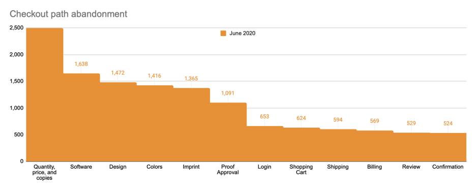
We started our work by using the platform Hotjar to analyze how users were navigating this complicated flow, and where they were dropping off. We quickly saw that the vast majority of the dropoffs were taking place at three particular steps: the first step, where users choose how many copies of the check they need, and the fifth and sixth steps, where users enter the information they want printed on the check and can see an automatically generated preview.
| Step | Sessions | Dropoff % | |
| 1 | Quantity, price, and copies | 2,487 | 34.1% |
| 2 | Software | 1,638 | 10.1% |
| 3 | Design | 1,472 | 3.8% |
| 4 | Colors | 1,416 | 3.6% |
| 5 | Imprint | 1,365 | 20.1% |
| 6 | Proof Approval | 1,091 | 40.1% |
| 7 | Login | 653 | 4.4% |
| 8 | Shopping Cart | 624 | 4.8% |
| 9 | Shipping | 594 | 4.2% |
| 10 | Billing | 569 | 7.0% |
| 11 | Review | 529 | 0.9% |
| 12 | Confirmation | 524 | — |
| Total Checkout Abandonment Rate | 68.0% |
While a 68% overall abandonment rate may sound high, it is within the normal range for an ecommerce site. That said, reducing it clearly represents an opportunity to generate more sales from their existing website visitors.
It wasn’t surprising to us that a lot of users were abandoning the site on the first step. That step is where the price breaks are revealed, and users are able to see the exact price for the specific number of checks they want to purchase. We believe many of the users abandoning the site at this point are largely in the research phase of their shopping, just checking CFL’s prices and not necessarily intending to make a purchase.
A user-experience analysis
More interesting to us: Why were users abandoning the site at the fifth and sixth steps? Was something about those steps frustrating them? Were there user-interface improvements we could suggest that might reduce friction and abandonments?
We again turned to Hotjar, using its Recordings feature to watch reconstructions of the actual user experience of a handful of real users who abandoned the site at that point. What we found surprised us: the vast majority of these users were fully completing these steps, spending considerable time successfully navigating the interface and filling out their information, and only abandoning after that. Why were they disappearing after spending all that time? We couldn’t tell from the data we had, and so we recommended a survey.
Asking the users directly
Our next step was to ask the users directly. Again using Hotjar, we added a temporary survey popup to step 5, the Imprint screen asking users “If you could change anything on this page, what would it be?”
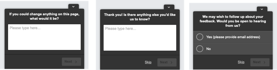
We showed this survey to users who had been on this page for at least 90 seconds without leaving or proceeding to the next step.
The users responded to us loudly and clearly: They really cared about how their finished checks would look, and they weren’t reassured by the preview. Here are some actual responses:
- Having the bank name on two lines
- Move extra line directly below name
- I would move the second line up a bit
- Larger, clearer sample of customer imprint as I design it
A significant portion of users specifically called out the line spacing on the check imprints (the part of the check with the check writer’s name and address). Here are some actual responses:
- spacing on the check heading
- Spacing
- The address looks clustered on the proof. Is it going to look like this when it’s printed?
- The lines seem to run together
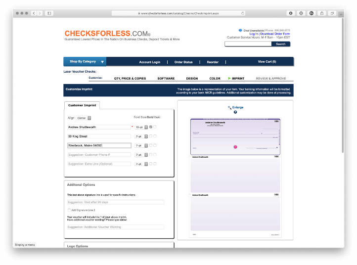
We went back to the actual website to see what these users were seeing. And with this feedback, the problem with step 5 became clear:
If users increased the font size from the default (and most users, it turned out, were doing this) the website increased the font size of the preview but not the line spacing, causing the lines to appear too close together. And although this was just a problem with the website — the actual printed checks would have looked right — users didn’t know that, and were abandoning their purchase.
And many users who didn’t abandon on step 5, the Imprint screen, were abandoning on step 6, the Proof Approval screen, which asked the user to check an “Online Proof Approval” box to attest that the “spelling, content and layout are correct.”
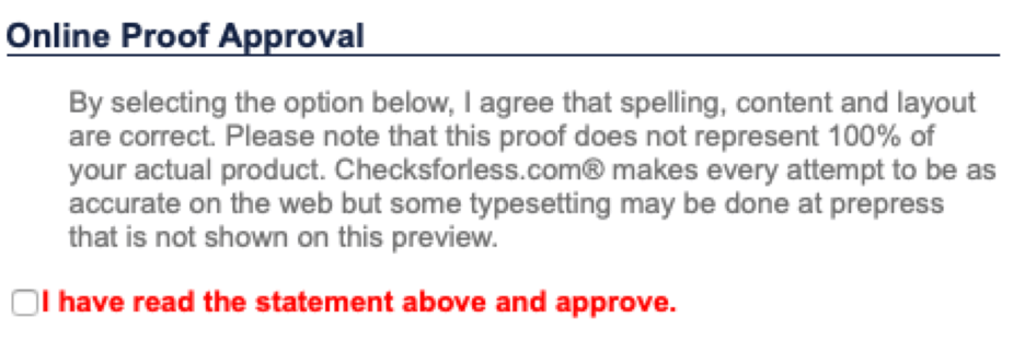
The issue was now clear: users were abandoning the site because the text in the preview didn’t look right, and the website was asking them to “approve” the preview as if it was a proof.
VONT presented these findings to Checks For Less. Overhauling the preview function was determined to be too big a project for the time being, so VONT recommended, as a stopgap measure, adding messaging to the site to reinforce that a human designer would edit the checks before they were printed, and to remove the phrase “proof approval.”
Results
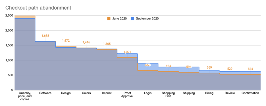
The CFL team implemented these changes, and a few weeks later, VONT re-ran our original checkout analysis. We found that a significantly lower portion of users were now abandoning the checkout flow on these particular steps.
| Step | June 2020 | Dropoff % | September | Dropoff % | |
| 1 | Quantity, price, and copies | 2,487 | 34.1% | 2,402 | 32.4% |
| 2 | Software | 1,638 | 10.1% | 1,624 | 12.3% |
| 3 | Design | 1,472 | 3.8% | 1,425 | 1.0% |
| 4 | Colors | 1,416 | 3.6% | 1,411 | 2.3% |
| 5 | Imprint | 1,365 | 20.1% | 1,379 | 11.4% |
| 6 | Proof Approval | 1,091 | 40.1% | 1,222 | 26.4% |
| 7 | Login | 653 | 4.4% | 900 | 14.2% |
| 8 | Shopping Cart | 624 | 4.8% | 772 | -0.4% |
| 9 | Shipping | 594 | 4.2% | 775 | 16.1% |
| 10 | Billing | 569 | 7.0% | 650 | 4.0% |
| 11 | Review | 529 | 0.9% | 624 | 0.8% |
| 12 | Confirmation | 524 | — | 619 | — |
| Total Abandonment Rate | 68.0% | 61.9% |
Conclusion
If your business were a brick-and-mortar store, you’d learn a lot about your customers and how to serve them better simply by spending time on the floor, watching and listening. If you saw a line had a tendency to bunch up awkwardly when the store got busy, you’d try rearranging things to accommodate. If you noticed customers were confused by a posted pricing policy, you’d clarify it. If you noticed that customers were looking in the wrong place for a particular kind of item, you’d move it, or add signage to help them discover it.
Analytics tools like Hotjar recordings and heatmaps are one of the ways we make that kind of watching and listening possible for website managers. It’s easy to set and forget a website, or to rely too much on your own experience of using your own website as a proxy for the experience of your users.
Without paying attention to your customers’ experience using tools and methods like these, there may be big trends influencing their purchase behavior or experience of your brand that you’re not picking up on. By one reading of the numbers, the changes described in this case study represent a 17% reduction in abandonment at that key step in the process, which could translate to a significant revenue increase month. The fix was subtle but the effect was not.
This kind of improvement isn’t something to be done just once and forgotten. We recommend routine observation of user behavior using these tools. Areas of improvement suggested by the data could populate a backlog of changes to be prioritized and worked on incrementally. A few hours of data-mining per month or quarter can give you significant insight into what’s driving your users’ behavior.
About VONT Performance Digital Marketing
At VONT we believe that change is the only constant in the digital world – and that excites us. When tools and environments are constantly changing, new opportunities to help our clients achieve success are constantly arising. Each new advertising technology, social platform, or design approach allows us to improve on the results we achieve for our clients.
We believe in this idea of continual fine-tuning so much that we named our company VONT, which means to achieve exponential improvement in incremental steps. It is our core belief, and the reason why we are not simply a web design company or simply a digital advertising agency, but rather a long-term, single source partner providing a comprehensive array of web development and digital marketing capabilities.
In short, we’re here so that our clients achieve success in the ever-changing digital world. If you’d like to learn more about VONT and the work we’ve done with our client partners, visit our Work page. Or, if you have a question, contact us. We’ll get right back to you!